Why are Emphasis Palettes so complex? Can they be simplified?
This is a discussion of a recurring issue - that's been raised recently in this PR discussion - and covered in #29 (closed) - since when the area has become more complex…
I want to describe how it got to the place it is, in the hope that doing so either in the writing or reading opens up ideas for ways to simplify / consolidate. The goal is that an end-user could just chose one colour for each emphasis context and feel safe it's applied as they'd expect.
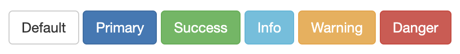
Emphasis colours are something Bootstrap brought to Civi (btn-warning, btn-success, btn-danger, etc below)…
Obviously a subtheme wants to be able to customise those colours, and it makes sense they match other uses of those colours - ie errror alerts, or warning notification or success regions. Initially RiverLea let you set emphasis colour variables, like --crm-c-success --crm-c-alert --crm-c-warning --crm-c-info… plus primary and secondary styles for the two default button colours Greenwich uses:
This also works with Shoreditch/Island (Walbrook):

You'll notice that the text colour varies white and black - this is specified by another value: --crm-c-alert-text or --crm-c-success-text.
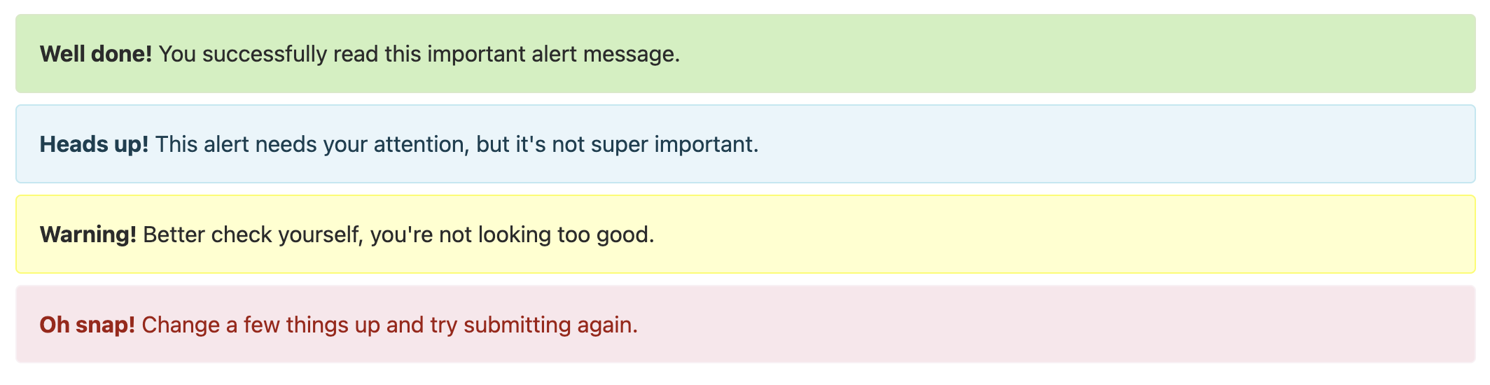
Then there's emphasis colours with Alerts
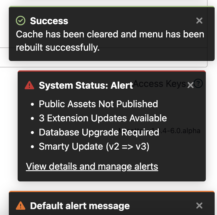
And there's Notifications which might need to contrast against black not white…
And then SearchKit introduces background modifiers to tables and popups:
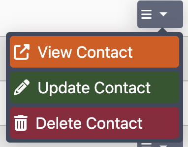
Then there's Finsbury Park (Hackney Brook), which only wants to apply colours to the icons, not the button backgrounds…

And all of these need to work in dark mode with a new set of colours and backgrounds to contrast against.
How RiverLea tries to resolve this…
- First we define a few shades of, say, green -
--crm-c-green,--crm-c-green-light,--crm-c-green-dark. - Then we define a universal emphasis colour for success -
--crm-c-success: var(--crm-c-green-dark)paired with a universal text colour to couple with that--crm-c-success-text: var(--crm-c-text-light)(text-light is normally white). - Then we define component-specific emphasis colours. E.g. for Buttons:
--crm-btn-success-bg: var(--crm-c-success); --crm-btn-success-text: var(--crm-c-success-text);. Then there's--crm-notify-successfor Notifications,--crm-icon-success-colorfor Icons, and Alerts--crm-alert-background-help,--crm-alert-border-help,crm-alert-text-help.
[At this point you can already see an inconsistency in the naming between btn (--crm-component-emphasis-focus) and alert (--crm-component-focus-emphasis), also that 'bg' and 'background' are both used.]
But wait - why does each component need to define its own colours when we've already defined universal emphasis colours? Because of the exceptions - e.g. buttons in HackneyBrook/Finsbury, or Help alerts in Walbrook/Shoreditch. But where it gets even more confusing is some of the component variables point to the universal emphasis bg/text pair (ie buttons in Minetta), some point directly to colour variables (ie alerts), and some specify their own colour entirely (notification colours in Minetta use a one-off tone to improve contrast ratio).
Can this be simplified further? Certainly names could/should be changed to make the semantics consistent. It's realistic to do this before 6.0 is released as it should change anything.
Another change might be to either scrap the use of of Universal emphasis pairs (8 css variables), or try to apply these variable names a bit more. E.g. here https://lab.civicrm.org/extensions/riverlea/-/blob/main/core/css/_variables.css#L223-225 the text could be safely set to crm-c-success and perhaps the border could match the text colour for simplicity. But these kinds of changes need a bit more test across streams and darkmode.
The other option - that is compelling but would need some proper testing if introduced at this late stage - is to use Relative Colours to process the core emphasis colours to get variations. This could work on all the alert styles, other than Walbrook help alert which behaves differently. There's also already some older version of this with the hover state for the emphasis buttons. E.g. (not tested example)
 --crm-c-success: var(--crm-c-green-dark);
 --crm-c-alert-success-bg: hsl(from var(--crm-c-success) h s calc(l + 50));
 --crm-c-alert-success-border: hsl(from var(--crm-c-success) h s calc(l - 10));
I think this would need a decent amount of testing because of the contrast ratio / a11y checks that have already been done on bg/fg colour combinations; it might work with three streams but not with a fourth (or with the darkmode version). But it would simplify things for developers. (and if the naming doesn't change then this could maybe happen after 6.0 without breaking consequences?)
To summarise
- fix inconsistent semantic structure of variable names
- fix inconsistent use of 'background' and 'bg', 'col' and 'colour/color'
- dble check the universal variables can't be applied more widely
- Use relative colours to create backgrounds, borders and hover state that relates to the core colour (??).
Activity
Thanks for the write up @nicol
I think the overall approach in terms of universal and component-specific emphasis colours is great.
What I think would be good to try and nail down is making sure vars are defined in pairs, with some predictability about which will contrast.
I.e. this seems good:
# streams should respect setting a dark green and a light text then this should contrast
# in every stream, dark mode or otherwise
--crm-c-success: var(--crm-c-green-dark);
--crm-c-success-text: var(--crm-c-text-light);
# it's totally up to streams what colours these are, and whether they are dark/light # but these vars should always contrast in all streams, darkmode or otherwise color: var(--crm-c-text); background-color: var(--crm-c-background);But these seem to be a few places where either they are mixed definitions
# light-text should always be light, but streams have a free choice about crm-c-text
# so we might end up with a light background and light text
#bootstrap-theme .label-default {
  background-color: var(--crm-c-text);
  color: var(--crm-c-light-text);
}
Or where only the background/text is set and it's not clear what it's going to appear on (I figure this is probably unavoidable in some places but would be great if we could minimise):
.crm-container .ui-spinner a.ui-spinner-button:focus { color: var(--crm-c-text-light); }Re: relative colours - I think that could be really nice to use in core when making defaults, to further simplify the job for streams.
E.g.
# core.css
--crm-c-green: green;
--crm-c-green-dark: color-mix(in srgb, var(--crm-c-green), #000 10%); # 10% might be way too much...
--crm-c-green-light: color-mix(in srgb, var(--crm-c-green), #fff 10%);
# mystream.css --crm-c-green: [more-bluey-green] # I dont have to worry about updating green-dark and green-light # but I can if I really want toEdited by ufundoBy the way, on naming consistency - I agree that would be good.
I don't think we need to rush that into
6.0- indeed I think it is too close to the release date to do so.We aren't advertising for people to start creating their own streams yet, so it's ok if this is done over the next months rather than days...

We aren't advertising for people to start creating their own streams yet, so it's ok if this is done over the next months rather than days...
Tho it's in the docs how to; I know of two streams out there already.
As we've got a couple of weeks I'd be tempted to try and get the simplest name changes into RL? Any variable name change later could break a stream.
mentioned in issue dev/core#5798
-
Some more examples: dev/core#5798 (comment 179178)
Just sliding across from the other thread...
where it gets even more confusing is some of the component variables point to the universal emphasis bg/text pair (ie buttons in Minetta), some point directly to colour variables (ie alerts), and some specify their own colour entirely (notification colours in Minetta use a one-off tone to improve contrast ratio).
I was thinking about this some more - and I think a good next step would be to try and pare down where component-specific colours are set at stream level. My sense is in the vast majority of cases, the assignment from
--crm-c-successto--crm-btn-successcould be done in core (excepting exceptions like Finsbury Park buttons). And then streams could be more limited to assigning the starting palette (--crm-c-success/--crm-c-success-text/--crm-c-info/--crm-c-info-text... ), and we would a) have simpler streams; b) have more chance of assuring accessibility.-
My sense is in the vast majority of cases, the assignment from
--crm-c-successto--crm-btn-successcould be done in core (excepting exceptions like Finsbury Park buttons)…Yes.. tho that's kinda how it is.. RL core re-uses
--crm-c-success/etc acrosstext-*bg-*panel-*label-*- no stream overwrites that. For Buttons, this is how Minetta works:--crm-btn-cancel-bg: var(--crm-c-alert); --crm-btn-info-bg: var(--crm-c-info); --crm-btn-warning-bg: var(--crm-c-warning); --crm-btn-success-bg: var(--crm-c-success); --crm-btn-alert-bg: var(--crm-c-alert);Walbrook changes only one of these:
--crm-btn-success-bg: var(--crm-c-green);. Thames changes all but one and Hackney/Finsbury changes all of them…Edited by nicol mentioned in commit themetest@efda3170