An Inlay for Form Processor
This extension allows you to create complex forms with sophisticated processing for CiviCRM. The forms can live on any website - even a simple HTML page. No coding is required, but an understanding of Form Processor is necessary.
The extension is licensed under AGPL-3.0.
Requirements
- PHP 7.4+
- CiviCRM 5.49+
- Inlay 1.3+
- Form Processor
Installation (Web UI)
Learn more about installing CiviCRM extensions in the CiviCRM Sysadmin Guide.
Installation (CLI, Zip)
Sysadmins and developers may download the .zip file for this extension and
install it with the command-line tool cv.
cd <extension-dir>
cv dl inlayfp@https://lab.civicrm.org/extensions/inlayfp/-/archive/main/inlayfp-main.zip
Getting Started
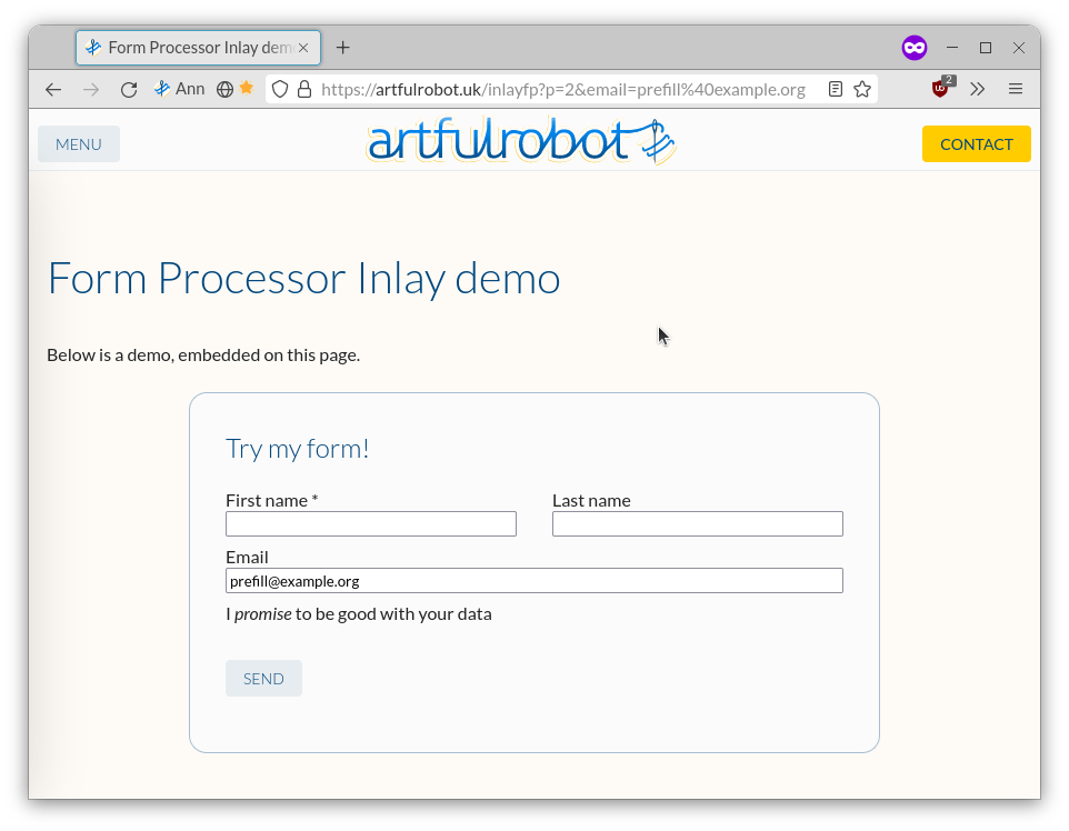
Form Processor builds an API that can receive data from a custom-built form. InlayFP will build an externally-embeddable form to collect this and submit it to your form processor.
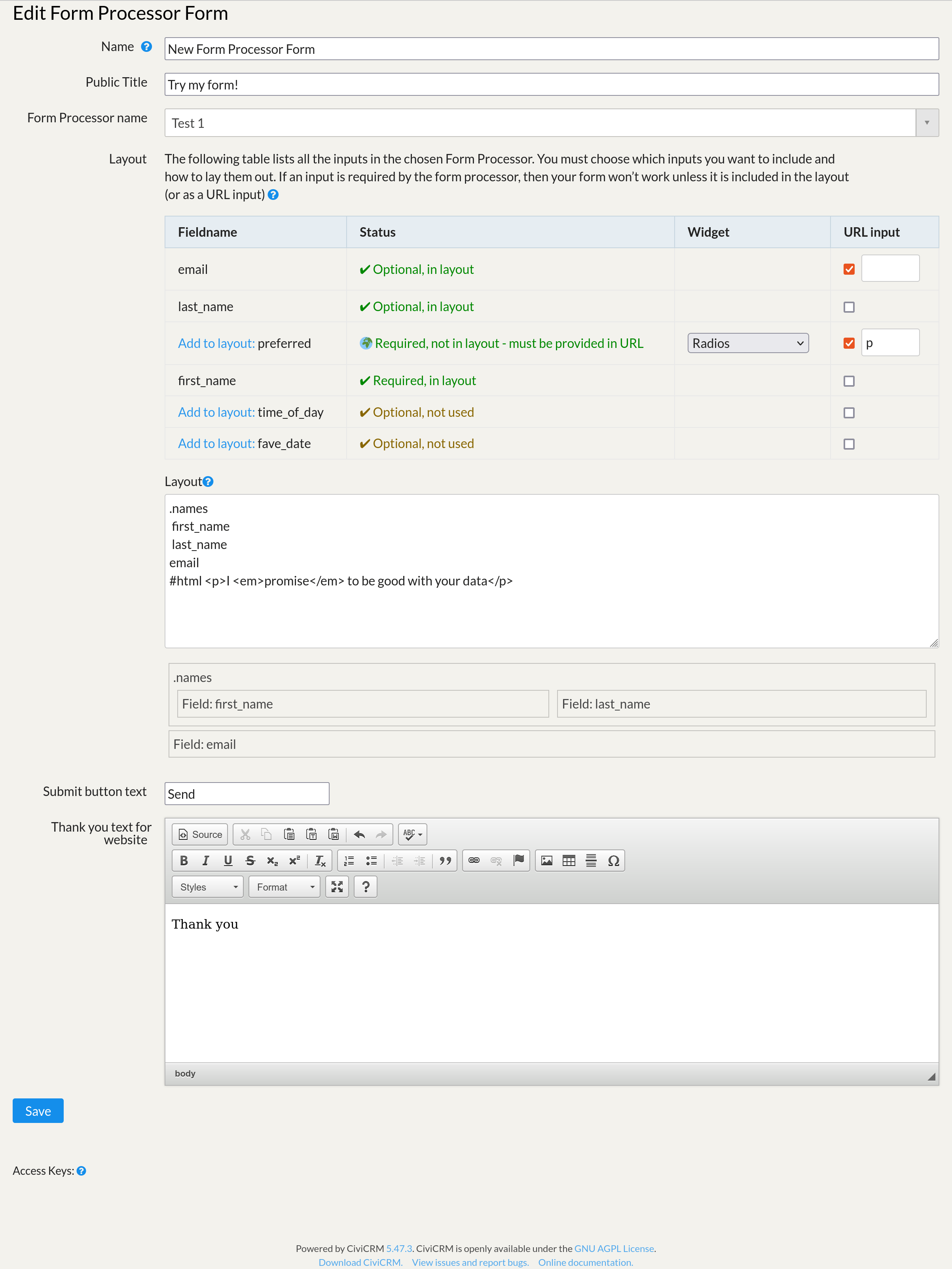
Creating a Form Processor Inlay
After installing Inlay, Form Processor, and this extension, create a new Form Processor (Administration menu » Automation » Form Processors). Refer to the Form Processor documentation for instructions. Once your Form Processor is complete, go to the Inlays menu (Administration menu » Inlays).
- Add a new Form Processor Form.
- Give the form a name, and optionally a public title.
- For Form Processor Name, select the form processor you want to build an inlay for.
- Click Save.
Configuring your inlay and building your form
The edit form shows you the fields from your Form Processor, and lets you add these to a layout in whatever order you like. You can choose to include all the fields or some (but of course anything you set as required in your Form Processor should be there or it won't work!).
This extension will detect the field type specified in Form Processor and use it to create a corresponding form input. For instance, an input of type "Date" will have a date picker (calendar) widget.
Groups and Headers
InlayFP supports adding groups to your form. You can use groups to create section headers and to display multiple fields on the same line.
- To add a group, enter a line starting with a dot, like
.group1. - Add fields to the group by indenting them with a single space. All fields in a group will appear on the same line.
- You can place a group within a group. Indent your fields an additional space for each level of grouping.
An example of a group might look like this, to place "city", "state" and "postal code" on the same line:
.address_line_3
 city
 state
 postal_code
By default, the name of your group will not appear on the form. However, you can turn them into section headers (large text labels) by adding a modifier to the group. The group modifiers are: ~h1, ~h2, ~h3, ~h4, ~h5, and ~h6. ~h1 is the largest header, ~h6 is smallest.
- A group doesn't need to contain fields if you only want to use it as a section header.
- Groups can not contain spaces in their name, but underscores will be converted to spaces in the form headers.
The following example shows two groups used as headers, but only one contains fields:
.Enter_Your_Information~h1
.Name~h2
 first_name
 last_name
email
phone
#html <p>You may wish to check our <a href=/privacy>Privacy Policy</a>
HTML
You can include a line of raw HTML by prefixing the line with #html. See example above.
Single Checkbox fields
If you have a boolean field, you have three choices for presentation:
-
do_you_support_human_rightsIncluding the field in the normal way will present the field's label and below that a simple Yes next to the checkbox. -
do_you_support_human_rights #labelThis will use the field's label in place of the "Yes" for the checkbox. -
do_you_support_human_rights #html Are you a <strong>reasonable person</strong>?This will present one checkbox with: Are you a reasonable person? as its label; the field's label will not be rendered.
Conditional field visibility
You can specify that some fields only show based on the value of other fields. For example, if you had a Favourite Colour select field with options including cyan and beige and red you could do:
favourite_colour
#html <blink>Oooh, I love that colour!</blink>[if favourite_colour=cyan]
#html <p>Really?</p>[if favourite_colour = beige]
And when the user selects cyan they'll see the excited message, and when the user selects beige they'll see Really?
You can apply [if ...] to #html, .groups or normal_fields.
⚠️ This only affects the visibility of fields; if your form processor requires fields that get hidden, the user’s submission will fail.
Supported syntax: [if <fieldname><operator><optionalvalue>]
Supported operators:
-
=you can omit the value to mean "if no value" -
<and<=and>and>=for less-than, less-than-or-equals, greater-than, greater-than-or-equals -
<>not equals. You can omit the value field to mean "if it has any value" -
~regular expression match. e.g.[if colour ~ /^(beige|cyan)$/]would matchbeigeorcyan
Changes between releases
v1.3.4
- 🌏 More translatable strings.
- Support
<select multiple >
v1.3.2
-
✨ Support optional custom CSS class applied to main container element. Nb.
there is already a class generated from the name of the form processor and prefixed
fp- - ✨ Support conditional fields/html/groups
- ✨ Support choice of radios/select fields for Boolean fields.
- ✨ Include a 'clear' button for radios where the field is not required.
v1.3.1
- ✨ Supports Form Processor validation - thanks @jaapjansma
Previous releases
-
1.2.1 Compatibility with Inlay 1.3
-
1.2 Completely reworks the edit screen, and allows pre-fill via URL query params (#4 (closed)). Fixes missing public title. Adds more classes that could be used by external CSS.
-
1.1 Various improvements and fixes, adds
#html
Known Issues
- If the form processor crashes/fails, the user is not told(!)
- Select boxes don't currently support multiple values, only checbkoxes do.
- The file upload widget has a hard-coded 10 megabyte size limit.
- The file upload widget show a preview of images, but shows a broken image icon for non-image files like PDFs.
Re-building Vue app from source
To install the tools, you need nodejs. Then from within this dir:
npm i -g yarn # Install yarn 'globally' (for your user)
yarn install
npx mix
After this you should be able to:
- do a dev build with
npx mix build - do a prod build with
npx mix -p - start watching source files, rebuilding as soon as they change with
npx mix watchNote that this builds the js file that is included in the Inlay bundle when the inlay bundles are recreated, e.g.cv api4 Inlay.createBundle +w id=123where 123 is the bundle you are working on.
Error codes
Various codes are used to communicate specific errors in a way that the end user could easily report but without giving them all the technobabble, e.g. FP2. If an error code is not listed here, just search the code for it. If an error is reported, check your CiviCRM log files for the error, usually there is a much more detailed explanation.
- FP1: Form processor failed to load. Probably you deleted it and the inlay now references something that's not there.
- FP2: probably you have set a field to required in your Form Processor, but not added it to your Inlay's config?
- FP3: either the same as FP2, OR the user did not send a required file upload
- FP4: the data sent for a file upload could not be parsed. Should not happen.