Text of activity action links has gone missing on manage case
Can reproduce on dmaster.demo. It seems to have started in 5.27 (surprise!)
- Create at least 2 cases. (The more dropdown doesn't appear if you only have one case.)
- In the activities section, click the more dropdown at the far right of any activity.
- There's no text for the action links.
Activity
added regression label
I see it. It's this one line:
https://github.com/civicrm/civicrm-core/pull/17319/files#diff-e89b4ee6d0539ac6a43be1b65bb7f128
@andrewhunt you might quickly know the solution here. I'm having trouble following all the icon PRs and what needs to be done to avoid outputting as sr-only. https://github.com/civicrm/civicrm-core/blob/d6c10c5caf58afc59141d0531b8003eeb67d4842/CRM/Case/Selector/Search.php#L649
Edited by DaveDAs best as I understand what the PRs were for, it's "working as designed", e.g. like how the pencil icon has replaced edit, and the text is intended to be sr-only. Except it doesn't look right and even if the background box was made thinner a vertical list of just icons leaves you guessing.
If I remove the icon definition from the relevant actions at the link above, then it goes back to normal, just the downside is the icons are then missing from the buttons on activity view.
Another option might be to have another css rule for
ul.panel .sr-onlywhich "undoes" the.sr-onlystyling, or target the .sr-only styling to more specific elements to begin with.I see what's going on. There wasn't any provision for icons in
CRM_Core_Action::formLink(), so I added that as a way to handle some action links that had previously been passed with HTML markup for thenamein order to display just an icon.However, it appears that this is one situation where
iconhad been set, even though it had no effect in the action links, as you can see in 5.21:
The new version noticed those
iconvalues and decided that the page is trying to have action links that are just icons. The reason "view" is still displayed is that it has no icon set inCRM_Case_Selector_Search::actionLinks().Digging some more, it looks like the
iconvalues in the actionLinks date to something @mattwire did in PR 14349 that I think is pretty slick: using the actionLinks to generate the buttons when viewing a single activity. The pattern isn't used anywhere else, but the buttons have icons--in addition to the text--ificonis set.I think the natural resolution is to pull these uses apart. I can think of two approaches:
-
Use
buttonIconinstead oficonto denote the icon that should be used in this buttons-from-actionLinks method. -
Use a new
linkDisplayoption, either per-item or per-set, that allows specifying whether an action link should display the icon, the name, or both.
I think the latter might be the more flexible option, since it's clear that Matt and I made different assumptions in entirely different parts of the codebase, and I suspect others may do similarly.
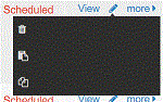
Incidentally, outside the scope of this issue, I notice that the display of the "more" is messed up, probably because it's attempting to fit the width of the
sr-onlytext:
-
Ok thanks for looking. Either one seems like it would work. I do think the lone pencil icon looks out of place and would probably prefer it say Edit, but if not then people will figure that one out.
For the more drop-down I hadn't noticed but on my screen it appears attached to the pencil icon.
Perhaps the more link can have a cowbell icon.
Thanks @andrewhunt - that frees @DaveD up for us to exploit him in other ways :-)
mentioned in commit 7261f9ca
mentioned in commit 8b6f1c70
mentioned in commit d9b19103
mentioned in commit 785f7831
changed milestone to %5.28.0
changed milestone to %5.27.4